Published -
March 6, 2026
Every great rebrand starts with a truth: the original name no longer captures the full ambition of the project.
That was the case with “Prospectus Chez Moi.” The name was useful, direct, and easy to understand. It described a service rooted in proximity, local offers, neighborhood visibility, and the idea of receiving useful information close to home. It belonged to a specific moment, a specific use case, and a specific way of thinking about communication: practical, local, immediate.
But over time, the project grew.
What started as a concept connected to local visibility and promotional discovery revealed a much bigger potential. It was no longer only about receiving information. It was about finding places, opportunities, experiences, good ideas, and meaningful local connections. It was about helping people discover what is around them, not in a passive way, but in a dynamic, intelligent, and curated way. The old name, while sincere and descriptive, was too narrow for this new ambition.
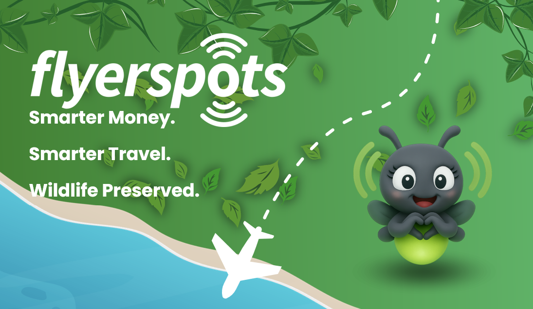
A brand like Prospectus Chez Moi speaks the language of distribution. A brand like Flyerspots speaks the language of exploration.
That shift matters.
The move from the old name to Flyerspots represents a strategic change in posture. It moves the brand away from the image of paper-based advertising and toward something more digital, more mobile, more experiential, and more emotionally engaging. “Prospectus Chez Moi” is functional. “Flyerspots” is alive. It suggests movement, discovery, lightness, mapping, and moments worth noticing.
The word “Flyer” carries a dual energy. It echoes communication, visibility, and promotion, but it also evokes motion, freedom, and the act of moving through space. Meanwhile, “spots” is one of the most powerful words in the vocabulary of travel and discovery. A spot is not just a place. It is a good place, a place someone wants to recommend, remember, revisit, and share. A hidden café is a spot. A panoramic viewpoint is a spot. A responsible artisan market is a spot. A nature-friendly hotel is a spot. A secret cove, a local organic shop, a committed restaurant, a meaningful stop on a journey—all of these can become Flyerspots.
This is why the rebrand feels so natural and so smart. It does not erase the original DNA of the project. It expands it.
The brand keeps the spirit of local usefulness, but gives it a new horizon. It moves from the mailbox to the map. From the leaflet to the lifestyle. From the neighborhood circular to the curated eco-travel experience.
And that is often the sign of a successful rebrand: it does not deny the past; it reveals what the past was preparing all along.
Flyerspots is therefore not a rupture. It is an elevation.
It says: we started by helping people discover what is near them. Now we help them discover what matters around them.

Some brand names sound good. Others do something much rarer: they immediately create a world.
Flyerspots belongs to that second category.
For an eco-responsible travel app, it is a particularly powerful name because it combines three essential qualities: it is memorable, flexible, and suggestive.
First, it is memorable because it is short, modern, and energetic. It has rhythm. It feels easy to pronounce, easy to visualize, and easy to turn into a digital product. In a world where apps compete for attention in seconds, this matters enormously. A good app name must be able to live on a screen, in a logo, in a conversation, on social media, and in the user’s memory. Flyerspots has that rare mix of clarity and personality.
Second, it is flexible because it can grow with the platform. It does not lock the brand into one narrow service. A travel app may begin by highlighting local places, but later include eco-friendly itineraries, ethical hotels, community recommendations, local guides, impact indicators, social sharing, rewards, or even coaching features. The name Flyerspots can hold all of that. It is broad enough to scale, yet distinctive enough to remain unique.
Third, and most importantly, it is suggestive. It invites imagination.
An eco-responsible travel app should not feel punitive or moralizing. It should inspire people. It should make better choices feel attractive, intuitive, and joyful. That is exactly what Flyerspots can do as a brand. It does not sound like a lecture about sustainability. It sounds like an invitation to discover better places in a better way.
That subtlety is essential.
Today, travelers increasingly want experiences that are more authentic, more local, and less harmful. They want to avoid standardized tourism. They want to find meaningful addresses, hidden gems, independent businesses, nature-friendly destinations, and communities that preserve local identity. They also want tools that help them act responsibly without making travel feel heavy or complicated.
Flyerspots answers this desire beautifully.
The brand naturally evokes the idea of smart discovery. It suggests a map of meaningful places. It fits a universe where travel is not just about consuming destinations, but about connecting with them more respectfully. It can embody a philosophy in which every selected spot has value: environmental value, human value, cultural value, or local economic value.
That is why the name is so well suited to eco-responsible travel.
It works on both levels:
Flyerspots also has a strong community dimension. People love sharing “spots.” Recommending a place is one of the most natural behaviors in travel. The brand can therefore support not only discovery, but also contribution. Users do not just consume content; they can help reveal the best eco-conscious places around them. In that sense, Flyerspots is not only a brand for an app. It is a brand for a movement of travelers who want to travel differently.
And unlike many sustainability-focused brands that sound abstract, institutional, or overly technical, Flyerspots remains warm and accessible. It feels friendly. It feels contemporary. It feels light enough for tourism, but meaningful enough for impact.
That balance is rare.
A brilliant brand for an eco-travel app must do more than describe a function. It must express a promise:
that travel can be freer, smarter, more local, and more respectful.
Flyerspots expresses exactly that.
Every memorable brand eventually asks itself an important question: beyond the name and the logo, who accompanies the user emotionally?
That is where a mascot becomes powerful—not as a decorative gimmick, but as a living symbol of the brand’s personality.
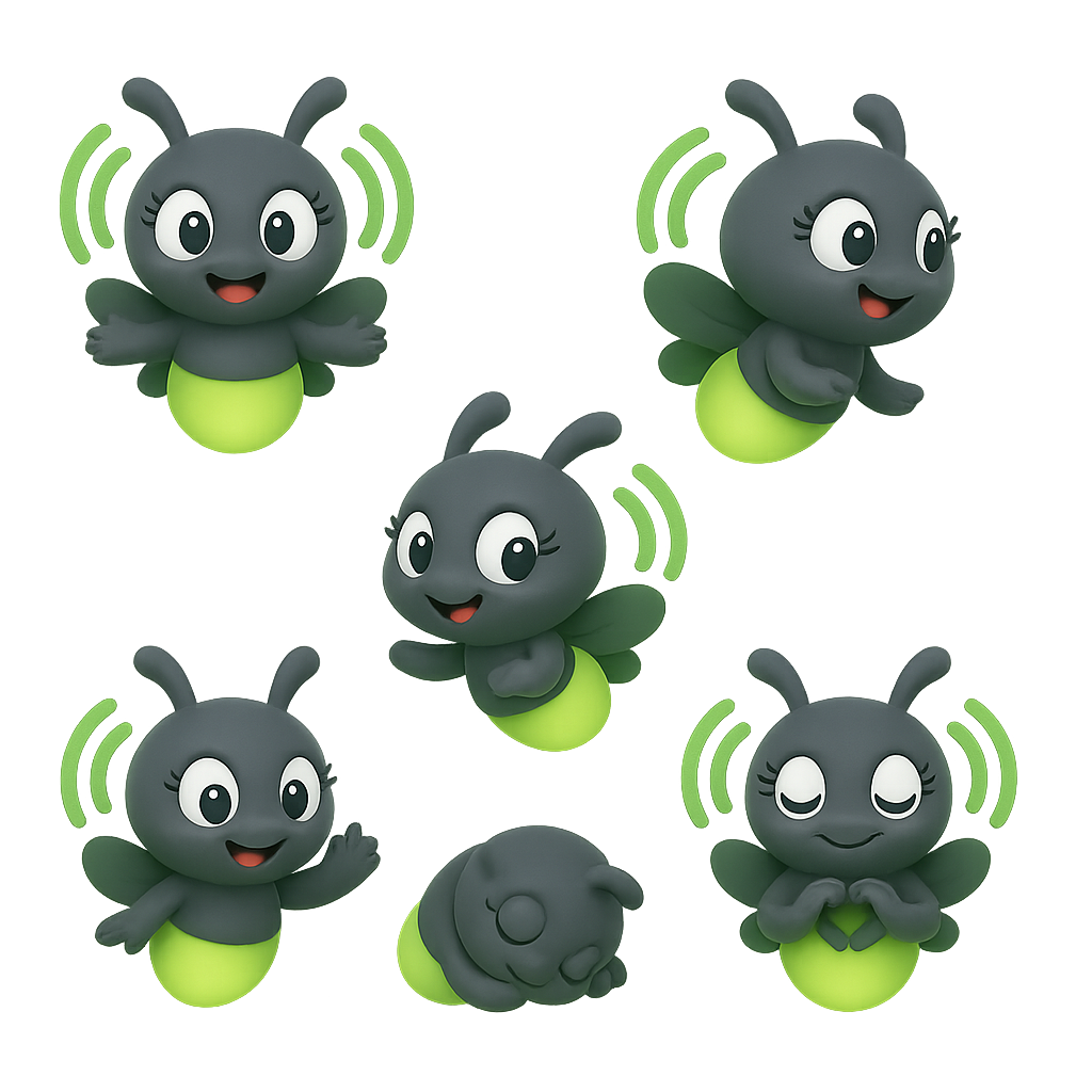
For Flyerspots, Lucie the firefly is an exceptional choice.
She feels immediately right because the firefly carries a symbolic richness that aligns perfectly with the brand’s mission. A firefly is small, graceful, luminous, and mobile. It does not dominate the landscape; it reveals it. It does not overwhelm; it guides. It appears like a little signal in the dark, a poetic point of light helping us notice what we might otherwise miss.
This is exactly what an eco-responsible travel app should do.
Lucie is the embodiment of intelligent guidance. She can lead users toward hidden gems, responsible addresses, and local treasures with gentleness and charm. She is not an authoritarian guide telling people what to do. She is a luminous companion inviting them to look closer, walk further, and choose better.
The symbolism becomes even stronger when we think about the experience of travel itself.
Travelers are constantly searching for orientation. They want reassurance. They want to know where to go, what to trust, what is authentic, what is worth the detour. A firefly naturally represents this role of subtle orientation. Lucie can become the friendly presence that says: “Here is a beautiful place. Here is a meaningful choice. Here is a better path.”
She is also perfect because she combines nature and magic.
Eco-responsible travel should remain practical, of course, but it should also preserve wonder. The most successful sustainable brands are not those that only measure impact; they are those that reconnect people with the beauty of the living world. A firefly does that instinctively. It belongs to nature, yet it feels almost enchanted. Lucie can therefore bridge the rational and the emotional sides of the app. She can stand for trust, ecological awareness, curiosity, softness, and delight all at once.
From a branding perspective, Lucie also offers enormous expressive potential.
She can welcome users during onboarding.
She can celebrate good choices.
She can suggest nearby eco-friendly spots.
She can explain features in a reassuring way.
She can reward progress and create emotional attachment over time.
In other words, she is not just a mascot. She can become the relational interface of the brand.
That matters more than ever in digital products. Many apps are efficient but cold. A mascot like Lucie helps create warmth. She gives the platform a face, a tone, and a soul. She makes the experience more human without making it less modern. For users, especially in moments of discovery or uncertainty, that emotional design can make the difference between a useful app and a beloved one.
There is also something deeply coherent in choosing a firefly for a brand called Flyerspots.
A firefly creates tiny living spots of light.
That connection is almost poetic. Lucie does not merely fit the brand identity; she deepens it. She turns the very idea of a “spot” into something luminous and alive. The world becomes a constellation of meaningful places, and Lucie becomes the one who helps users see them.
Finally, Lucie is a perfect mascot because she is optimistic. She suggests that even small lights matter. Even small choices matter. Even one good spot, one local business, one eco-friendly hotel, one responsible détour can change the quality of a journey. That is a beautiful message for Flyerspots, and an even more beautiful message for the future of travel.
The story of Flyerspots is the story of transformation with continuity. What began as Prospectus Chez Moi, a useful and grounded local initiative, evolved into a broader, more ambitious, and more inspiring vision. The new name captures movement, discovery, digital energy, and local value. It opens the door to a brand universe much larger than traditional promotional communication.
As a name, Flyerspots is remarkably strong for an eco-responsible travel app because it makes sustainability feel dynamic, social, and desirable. It evokes curation, mobility, local gems, and meaningful exploration. It speaks to a new generation of travelers who want more than destinations: they want alignment between their journeys and their values.
And with Lucie the firefly as its mascot, Flyerspots gains something even more precious: a gentle light to guide the experience. Lucie brings warmth, clarity, poetry, and trust. She transforms the app from a platform into a companion.
Together, the name and the mascot tell a clear story:
travel can be smarter,
travel can be more local,
travel can be more beautiful,
and travel can leave a lighter footprint.
That is the promise of Flyerspots.
Not just to help people go somewhere, but to help them discover the right places, in the right way, with a little light leading the path.
Brands are not born by accident. The strongest ones emerge from a real need, a lived experience, and a vision that becomes clearer over time. That is exactly the story of Flyerspots. Behind the name lies more than a marketing idea: it is the evolution of a practical service into a wider mission, one that connects local discovery, responsible travel, human connection, and positive impact.
This is the story of a brand that began with a very concrete promise, then transformed into something much more ambitious: a smart, friendly, and eco-conscious travel companion for a new generation of explorers.
